How to implement "light dismiss" in a React menu component
Let's adapt Adam Argyle's example for a dialog to build an account menu component in React that supports "light dismiss". This will be a basic version of the one I recently built for kittycad.io.
Adam Argyle's episode
I really enjoy Argyle's GUI Challenges series on his YouTube channel and web.dev. I've learned a ton of real details about how to build components that are progressively enhanced and accessible. I feel like so many frontend writers discuss how you should build components that way, but not details on what that looks like.
In his episode on "Dialogs", Argyle mentions a term of art I hadn't heard before: "light dismiss". This is the ability to click outside of a component or press the Escape key to dismiss it from view and focus order. I had never heard the term but it is a common expected behavior for users for popups, menus, and dialogs. In fact, the dialog HTML element supports Escape to dismiss by default with no additional JavaScript.
Argyle's episode walks through a robust example for a mini and "mega" dialogs, but I was looking to build a menu component for the top nav of my company's website, kittycad.io. And our website is a NextJS app, so I needed to translate Argyle's implementation using vanilla JavaScript and Web Components into a React component.
what we're building
Here is a mockup of the component we're building:
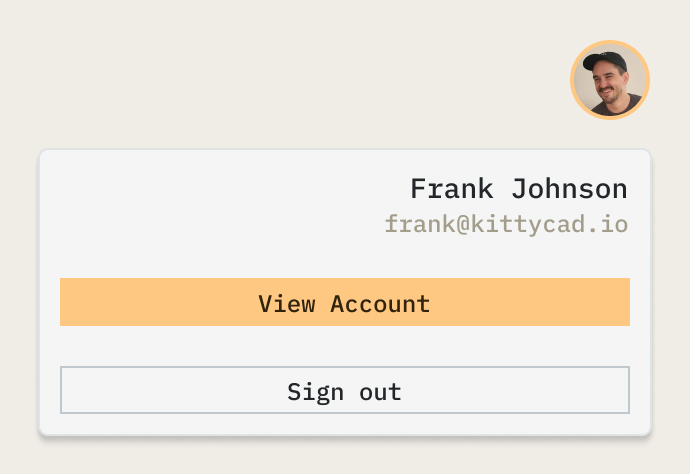
An avatar button reveals an account menu below it whenever the user clicks it. This menu should be able to:
- be opened and navigated through with the keyboard
- not appear to screen readers or keyboard users unless the menu is opened
- be dismissed by doing any of the following:
- clicking the avatar again while the menu is open
- clicking anywhere outside of the menu
- typing the
Escapekey while focused on any element within the menu
the basic HTML
Let's start by creating an AccountMenu.tsx component file and putting some basic HTML as a skeleton of our component. We'll add some event listeners and conditionals shortly.
I like to use CSS Modules in my NextJS projects, so I'm showing you how I would use it on a component like this. We won't get into styling here, but I'd like to start writing more about CSS because I think it's really powerful and fun to use.
One other preface I'll add is that we'll assume that this component always has a user to pull data from, and pull in an imaginary User type from our authentication solution. My production version of this component is a little more defensive about what state is available to us, but this will keep things simpler for our discussion.
// AccountMenu.tsx
import styles from './AccountMenu.module.css'
import type { User } from '../somewhere-else/auth'
import { useState } from 'react'
import Link from 'next/link'

export default function AccountMenu({ user: User }) {
	const [open, setOpen] = useState(false)

	return (
		<div className={styles.wrapper}>
			<button className={styles.avatar} onClick={() => setOpen(!open)}>
				<div className={styles.roundImageWrapper}>
					<img src={imageSrc.current} alt={user?.name || 'No user'}/>
				</div>
				<span className="visually-hidden">Open menu</span>
			</button>
			<menu role="dialog" className={styles.menu + ' ' + (open ? styles.open : '')}>
				<div>
					<p>{user?.name || 'Unnamed User'}</p>
					<p>{user?.email || 'someone@somewhere.com'}</p>
				</div>
				<Link href='/account' className={styles.buttonLink}>
					View Account
				</Link>
				<button onClick={() => signOut()} className={styles.buttonLink}>
					Sign Out
				</button>
			</menu>
			<div className={styles.backdrop} onClick={() => setOpen(false)}/>
		</div>
	)
}
Alright, let's break this down:
- We create a wrapper element to go around our button and menu
- We make a button with an avatar image that will toggle our menu. It toggles the
openstate when clicked, or when a user hitsEnterwith the button focused. - We give this button a
.visually-hiddenlabel. I always put Heydon Pickering's visually-hidden CSS class in my global stylesheet for every single project I work on, and you should too. Use it to label anything that is only for screen reader users. - We have a menu element with a dialog ARIA role. This menu contains all the items in the mockup.
- Finally, a backdrop element is placed within the component. This will power our light dismiss, once we style it correctly.
a workaround for the inert attribute in React
The first requirement I want to complete is this one:
The menu should not appear to screen readers or keyboard users unless the menu is opened.
The best practice to accomplish this is with the inert HTML attribute. It accomplishes this exact functionality and more, and is made for hiding an element from the accessibility tree of the document. However, the inert attribute is not supported by React. There is a long-standing PR to fix this in React, but at time of writing it has not been merged.
So in the meantime, let's build a workaround using useEffect and useRef to set it manually on the menu element using the standard setAttribute() function.
// AccountMenu.tsx
import styles from './AccountMenu.module.css'
import type { User } from '../somewhere-else/auth'
import { useState, useRef, useEffect } from 'react'
import Link from 'next/link'

export default function AccountMenu({ user: User }) {
	const [open, setOpen] = useState(false)
	const menuRef = useRef<HTMLElement>(null)

	// set the menu to be inert when it's closed
	// this prevents the user from tabbing into it
	// React doesn't support the inert attribute so we have to do this manually
	useEffect(() => {
		if (!open && menuRef.current) {
			menuRef.current.setAttribute('inert', '')
		} else {
			menuRef.current?.removeAttribute('inert')
		}
	}, [open])

	return (
		<div className={styles.wrapper}>
			<button className={styles.avatar} onClick={() => setOpen(!open)}>
				<div className={styles.roundImageWrapper}>
					<img src={imageSrc.current} alt={user?.name || 'No user'}/>
				</div>
				<span className="visually-hidden">Open menu</span>
			</button>
			<menu ref={menuRef} role="dialog" className={styles.menu + ' ' + (open ? styles.open : '')}>
				<div>
					<p>{user?.name || 'Unnamed User'}</p>
					<p>{user?.email || 'someone@somewhere.com'}</p>
				</div>
				<Link href='/account' className={styles.buttonLink}>
					View Account
				</Link>
				<button onClick={() => signOut()} className={styles.buttonLink}>
					Sign Out
				</button>
			</menu>
			<div className={styles.backdrop} onClick={() => setOpen(false)}/>
		</div>
	)
}
Our new useEffect call checks if the menu is open and adds the inert attribute unless it is, in which case it removes the attribute.
useInertAttribute hook if you like!
dismiss on Escape key
Alright just two more requirements to meet. Next let's make the menu able to be dismissed with the Escape key. This is actually very straightforward. All we have to do is add a keyboard event listener to the menu element. I chose to use the onKeyUpCapture event because I figured we should wait until the user releases the key to dismiss the menu. This is a one line addition:
// AccountMenu.tsx

// ...
			<menu ref={menuRef} role="dialog"
				className={styles.menu + ' ' + (open ? styles.open : '')}
				onKeyUpCapture={e => e.key === 'Escape' && setOpen(false)}
			>
// ... rest of the file
Within this event callback we first check the key pressed was the Escape key, then we simply set open to false if it was. This event will only fire if the user has keyboard focus within the menu element.
styling the backdrop element for light dismiss
Alright, the actual light dismiss functionality is all that we need now. Argyle's dialog video has a bit of an easier time with this, because the dialog HTML element has a ::backdrop pseudo-element. Unfortunately as you've seen above, we needed to add our own div in order to implement this.
The rest of our work will be in CSS over in AccountMenu.module.css. I won't go over all the styles for this component in this post, but here are the relevant pieces we need for our backdrop:
.backdrop {
	position: fixed;
	pointer-events: none;
}

.menu.open + .backdrop {
	pointer-events: all;
	inset: 0;
	z-index: 1;
}
By default our backdrop will not be interactive, but if it follows the menu in its .open state, it will accept all pointer events, cover the entire screen with the inset property (a nice shorthand for top, right, bottom, and left), and be given its own place on the z stacking order with z-index: 1.
And just like that we have a simple, menu component in React that is keyboard and screen reader accessible, which supports light dismiss by clicking outside of the menu! 🎉
I've made a demo you can check out live in Codesandbox here. Be sure to reach out if you have any questions, and happy making!