The role of texture in Amsterdam's road network
One of the many things I was struck by when I lived in Amsterdam for the month of August 2024 was how different transit modes were given distinct textures in the road network. This was often just a reinforcement of more concrete se paration between modes, as nearly everywhere that space allowed I was cycling on a fully protected and separate bicycle lane. However, it provided even more important benefits when separated bike lanes had to end.
When a bike lane must be integrated with more dangerous transit modes like cars and trucks, it should continue to have a distinct texture and look, so that it is clear that this is a bike lane first, and a car road only when necessary, because of course motor-vehicles-should-be-secondary. Note the color and material of the bike lane here looking toward the Amstelveenseweg tram stop:
Furthermore, using mostly-consistent textural differences between modes communicates to users when they're in the right or wrong place immediately, and without signage. It takes very little time in Amsterdam to know that if you look down and see a rust-colored asphalt you are not in the right place and should probably move out of the bike lane real quick.
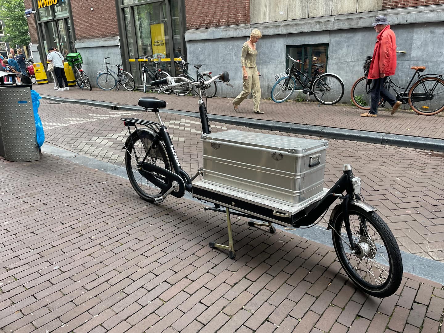
This is in the same vein as other great norms of separation that I saw while in Amsterdam, such as at-grade pedestrian crossings. Hitting a small speedbump when crossing over a pedestrian thoroughfare is a small reminder to every driver that they wield heavy and dangerous machines, and that they are guests in a pedestrian space. In the background of this photo you can see such a crossing, as well as many bicycles and a handsome cargo bicycle.